Building an Identity with Logos, Vehicle Wraps, and Jingles
Branding helps HVAC contractors connect with the community members they serve
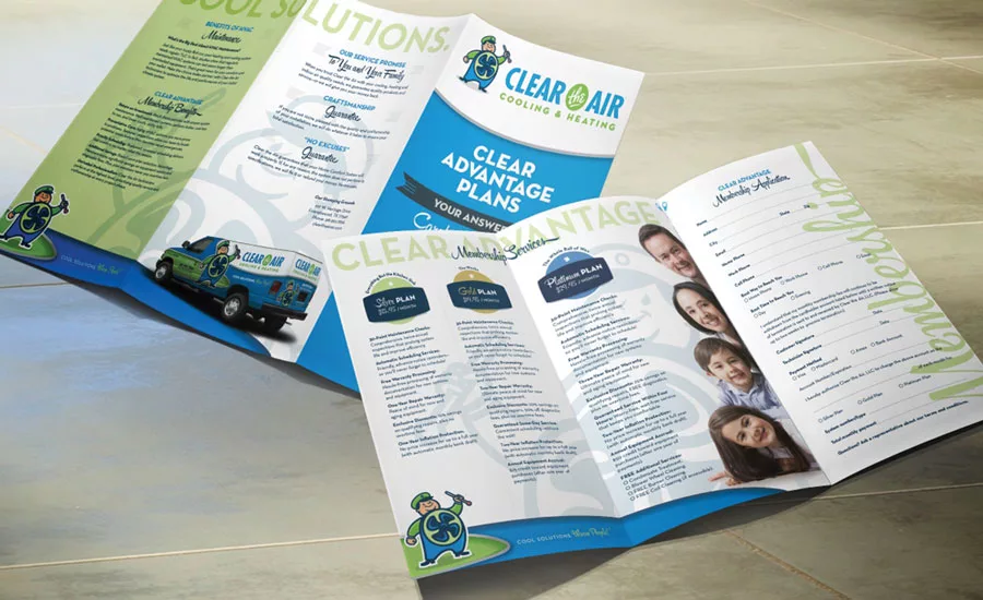
MARKET ADVANTAGE: Clear the Air in Alvin, Texas, completely updated its brand to include a new logo, website, marketing materials, and vehicle wraps. Within the first year, the company moved into a new 13,000-square-foot building and experienced a 35 percent growth in revenue.
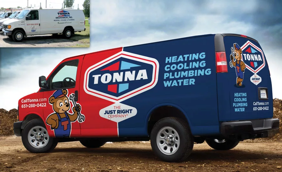
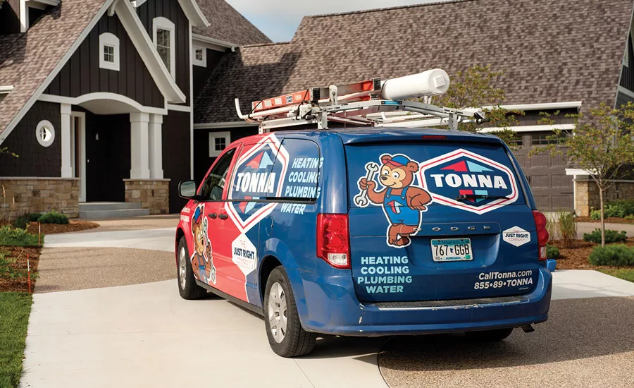
OUT WITH THE OLD: Tonna Mechanical has a total of 35 trucks, 25 of which are branded with new vehicle wraps. The goal is to eventually have all 35 vehicles wrapped in the new brand as opposed to the plain white trucks pictured top left.

REMEMBER ME?: Clear the Air’s new brand helps make the company memorable to the community. Jason Stom, CEO, said he is constantly hearing from customers on how much they love the new brand, especially the Fan Man mascot.
STANDING OUT: Rochester, Minnesota-based Tonna Mechanical decided to rebrand its business to keep from blending in with other HVAC contracting companies.
Branding is huge.
Dan Antonelli, president and creative director of Graphic D-Signs Inc. in Washington, New Jersey, preaches the importance of these three words to his HVAC clients on a daily basis.
“While most heating and air guys provide their customers great service, you’d never assume that by the way they appear,” he said. “Appearance is an opportunity to match the deliverable with the expectation the brand personifies. It’s important to control that first impression and make the consumer feel that this company is reputable, professional, and willing to be around in a year if something goes wrong with the service they provided or the system they installed.
So few contractors capitalize on the message their brand communicates, which opens the door of opportunity for those who do embrace branding.
“Our clients’ competition is communicating neutral or negative brand messages. As a consumer, if I had to judge that company purely on what I saw on the side of their trucks or what their websites looked like, I would have a negative or neutral impression.”
To Antonelli, branding is summarized as the way one describes your business to another.
“The nuts and bolts of the brand are what wheels are to a bicycle. At the center of the wheel is a hub, and in that hub is the logo. And, the spokes that comprise that bicycle wheel are all the different touch points the logo integrates, such as social channels, vehicle wraps, uniforms, brochures, websites, and more. All the spokes going around that wheel are the brand. The logo lives at the center and drives everything else. If you don’t start with a good foundation — if that logo isn’t a good foundation — all the other elements that integrate with the logo will suffer.”
FIRST IMPRESSIONS
An HVAC contractor’s truck is one of the company’s most important branding sources.
Looking for quick answers on air conditioning, heating and refrigeration topics? Try Ask ACHR NEWS, our new smart AI search tool. Ask ACHR NEWS
“The truck is a public personification of a company,” Antonelli said. “The community sees the truck driving around and will judge the company’s reputation based on what that truck projects. Ask yourself, ‘Do you think more people are going to be drawn to a company’s trucks that feature magnetic signs stuck to the back or those with clean, professional, appealing full truck wraps?’”
It’s important to make sure the marketing message is legible from a distance and that people are able to discern the unique characteristics of the brand.
Antonelli never includes photographs in his truck wrap designs, choosing instead to make the wrap entirely about the company’s brand, because the brand will always be relevant.
“A lot of times, trucks will include elements that don’t accelerate their branding. Adversely, these elements marginalize the message. Photographs of HVAC units or pictures of homeowners with blue skies and green grass are fine, but they come at the expense of that company’s brand. Photographs of condensing units or furnaces don’t represent the company. When you see that kind of stuff, you may be able to recognize it’s a heating and air conditioning contractor’s truck, but do you know which company that truck is representing? Also, as equipment evolves, old photographs may date the truck.”
The majority of heating and air contractors exclusively feature the colors blue and red,” Antonelli said. “Which is fine, but there are so many other companies deploying the same color schemes, and you don’t want to be confused with your competitor. So, the colors you choose become yet another point of distinction. I encourage companies to think outside the box in terms of picking colors, which helps the company stand out.”
Graphic D-Signs created branding solutions for Rochester, Minnesota-based Tonna Mechanical Inc. when the company decided it was time to freshen its existing brand. The scope of work included Tonna’s website, vehicle wraps, collateral, stationary, social media, email marketing, and marketing strategy.
“We felt like we were just blending in,” said Patrick Murphy, president of Tonna Mechanical. “We had white trucks and a simple blue and red logo. We felt we had to do something to set ourselves apart. We had been using the whole Goldilocks analogy where we were the ‘Just Right Company’ — not too hot, not too cold, but just right. Admittedly, our in-house marketing just wasn’t working.”
Tonna attempted various renditions of its Just Right Bear with different marketing companies, but failed to achieve the results it was looking for.
“We’re a professional service company, so we didn’t want to come off as cheesy, per se,” said Murphy. “It just didn’t seem to be working. So, when we were able to connect with Dan and his team, we started talking about continuing that theme in branding. They hit the nail on head with the first rendition of the character and logo. We all sat at the table and said, ‘This is it, this is what we’ve been looking for.’ It wasn’t cheesy, and we could put it on a truck and not be worried we would look like some children’s book on wheels.”
Tonna has a total of 35 trucks, 25 of which are branded with the new vehicle wraps. The goal is to eventually have all 35 vehicles wrapped, Murphy said.
“I can’t go anywhere without somebody saying, ‘I saw your truck today,’” Murphy said. “We never heard this before. But now, I’ll be at networking events or just be out locally in the community, and people will recognize the logo on my jacket and mention they saw our trucks or comment on how we have so many trucks. And, we don’t have that many trucks, actually. They’re just more noticeable and memorable now.”
Since the rebranding, Tonna has experienced a three-fold increase in calls to its small plumbing and water treatment department. “Our service and replacement business on the home comfort side has increased drastically, as well. Generally, we’ve seen anywhere from 15-30 percent increases in revenue each year.”
MEANINGFUL TAGLINES
Taglines are another way to help HVAC contractors enumerate and share their unique selling propositions.
“It’s useful to have taglines that speak to something related to what the overall campaign is trying to communicate,” said Antonelli. “Taglines are most effective when the name of a company doesn’t identify what it does.”
One such tagline — Cool Solutions, Warm People — belongs to Alvin, Texas-based Clear the Air. Graphic Designs helped create a retro-theme brand for the company that includes a Fan Man mascot and logo, vehicle wraps, collateral leave-behind materials, and a revamped website.
Jason Stom, CEO of Clear the Air, said he felt the company needed a stronger marketing message and began researching the more successful brands both inside and outside of the HVAC industry. “I slowly realized we needed to make a change in order to stand out. It started with talking about just changing our logo. Then, one thing led to another, and we ended up rebranding the entire company.”
Clear the Air finished its vehicle wraps and had new marketing materials in hand at the end of the first quarter last year, and its website was completed by the end of the second quarter.
“It tremendously changed our company morale and how the public viewed us,” Stom said. “We went from a small, 3,000-square-foot shop to a 13,000-square-foot building. And, I’m not going to put it all down to rebranding — there was a lot of other work involved — but it gave us the push we needed.”
Clear the Air grew 35 percent last year.
“We constantly get feedback from customers about how they love our new brand,” Stom noted. “They like the Fan Man, which is built out of an old vintage fan. People like the company’s new blue and green colors.
“Too many contractors seem to ignore branding,” he continued. “If I could have done this earlier, I would have. I regret not doing this sooner, as the results have exceeded our expectations.”
CATCHY TUNES
Tammy Ferris, owner of Love Plumbing, Air & Electrical in West Columbia, South Carolina, purchased the plumbing contracting company from Gene and Kathy Love in 2006. She decided to keep the name because the company was well-known in the community, having been founded in 1981. However, after adding HVAC and electric services, she decided the business needed a facelift.
“We wanted to add freshness to the company,” Ferris said. “Our former logo was your typical blue and white plumbing logo with a pipe wrench in the middle, much much like most plumbers use. We didn’t have a tagline or anything, and I wanted to look different from everybody else in the market.
“I also wanted to appeal more to women,” she continued. “Most of our calls are from women, and women don’t care about pipe wrenches.”
Gene Love’s logo was updated to the word Love with a capital ‘V.’ The brand also includes colorful flowers.
“I love flowers, especially daisies, because they’re colorful,” Ferris said. “We started kicking around the idea, ‘Why can’t we put flowers on a truck?’ So, the Gerbera daisy became the anchor. And our color scheme has purpose to it. Blue is the color of peace and calm, which we aim to bring to our customers, and orange is the color of urgency and joy, which we believe signifies the fact that we’re there when you need us. We also added in green, which represents growth.”
Gene Love’s “We Love to Help You” tagline is the first thing customers hear when they call, and the phrase has become a well-known jingle within the community.
“People remember songs,” said Ferris. “They stick in your head. And, our number, 719-LOVE, is incorporated in the song. It’s something fun that people remember. Oftentimes, I’ll be out shopping and somebody will recognize me and serenade me with the jingle.”
Ferris feels rebranding has helped grant Gene Love with top-of-mind market awareness.
“People in the community know who we are,” she said. “Our services aren’t like retail items — you can’t have a sale on shirts, broadcast it, and have people think, ‘Oh, I would like a new shirt, I’ll go to that store and buy one.’ When people have a problem, you want your name to come to mind. You want them to feel like they can trust you. Rebranding has done that for us.”
Publication date: 2/1/2016
Want more HVAC industry news and information? Join The NEWS on Facebook, Twitter, and LinkedIn today!
Looking for a reprint of this article?
From high-res PDFs to custom plaques, order your copy today!


